Those of us with a little (or, in my case, more than a little) gray hair will remember the “dot-com bubble” of the late 1990s. The Internet was expected to vastly affect daily life both for individuals and for corporations; a wide variety of companies perceived as being related to the Internet became red-hot investments almost indiscriminately.
It was not just startups that were granted huge valuations. Microsoft, in 1999, was the most valuable company in the world, surpassing GE, the longtime leader. (And now we shake our heads at how mighty GE has fallen from its glory days). The top ten were rounded out by Cisco, Wal-Mart, Exxon Mobil, Intel, NTT (Nippon Telephone), Lucent Technologies, Nokia, and Deutsche Telekom. A lot of technology companies, but also companies that actually made things.
1999 looms large in my mind, since it was my first year acting as an investment advisor after spending years working in other areas of financial services. It was a challenging year in which to start, especially given that I had chosen to join a firm with a distinct bias toward value stocks, which were out of favor in that environment.
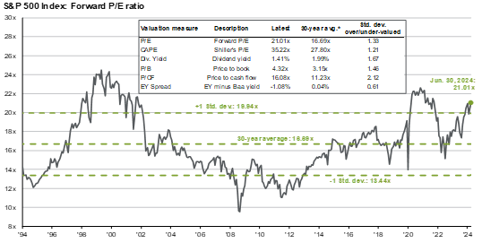
Chart 1 shows the forward price/earnings ratio of the S&P 500 from 1994 to the present. You can easily see the huge run-up in valuations starting in 1995 and persisting until about 2002. Even though the equity bubble broke in March of 2000 and the S&P lost 50% of its value in three years, the high P/E ratios persisted for a while because the “E” (earnings) declined even more rapidly than the “P”.
Chart 1
Source: FactSet, FRB, Refinitiv Datastream, Robert Shiller, Standard & Poor’s, Thomson Reuters, J.P. Morgan Asset Management
Back then, in one of the essays that I wrote for clients, I commented that the S&P, despite being comprised of 500 stocks, was really dominated by a handful of large companies. While there is an equally weighted version of the index (i.e., each stock factors equally into the value of the index), the capital-weighted version is by far the most popular.
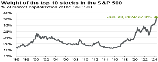
So, although people thought that they were buying a basket of 500 stocks by owning the index, they were (and are) getting exposure primarily to a relative handful of stocks. Chart 2 shows the percentage of the index that is represented by just the 10 largest stocks…i.e. 2% of the index components. This percentage was less than 20% prior to the late 1990s and rose to about 26% in 2000, as I commented at the time. It has been steadily rising since about 2015, and now stands at a startling 37%. That means that well over ⅓ of the value of the index – what you are buying when you own the index – is represented by just 10 stocks.
Chart 2
Source: FactSet, Standard & Poor’s, J.P. Morgan Asset Management
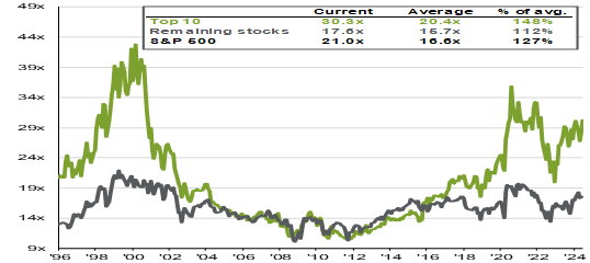
These 10 stocks are very expensive, as shown in Chart 3. Their current average P/E is 30.3, compared to a historical average of 20.4 for the top 10 S&P stocks. That means they are about 50% more expensive than they normally are. In contrast, the other 490 are only 12% more expensive than the long-term average.
There are only two recent precedents for such high valuations. In 2020 and 2021, valuations peaked at even higher levels, briefly exceeding 34x, before the sharp declines that we experienced in 2022. During the dot-com bubble, stocks were above 30x starting in 1998 and peaked at well over 40x before dropping precipitously, all the way down to the low teens. It has only been in the 1996-2000 and 2020-2024 periods that the valuations of the top 10 stocks deviated so greatly from the rest of the index.
Chart 3
Source: FactSet, Standard & Poor’s, J.P. Morgan Asset Management
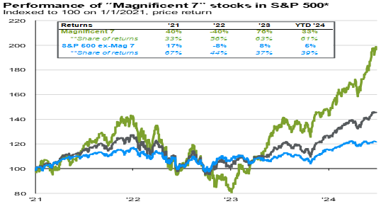
Which brings us back to the current day. Much of the recent performance of the S&P has been driven by the outsized results of the so-called “Magnificent Seven”. The Mag 7 – Google, Microsoft, Apple, Tesla, Meta, Amazon, and Nvidia – has replaced the group that we used to call the FAANGs (Facebook, Apple, Amazon, Netflix, and Google) although as you can see, there is a great deal of overlap between the groups (Facebook = Meta). Chart 4 shows the recent performance of the S&P and the influence the Mag 7 has had.
Chart 4
Source: FactSet, Standard & Poor’s, J.P. Morgan Asset Management
The Mag 7 were not so magnificent in 2021 and 2022. In fact, as a group, they lost 40% of their value during 2022 alone, much worse than the rest of the index, which is an indication of the risks involved in owning this group. But in 2023 and 2024, they have been responsible for over 60% of the index’s returns. In fact, while the index returned 15% in the first six months of this year, the 493 “non-magnificent” stocks returned a modest 5%. That explains a lot about why many managers, especially value-oriented ones, have underperformed so significantly.
What are the parallels to 1999? Well, we have extreme concentration of the S&P 500 index in a handful of stocks. In fact, the concentration now is far beyond what it was back then. Secondly, this handful of stocks has been responsible for the majority of returns in the index in the past 18 months. Third, the stocks responsible for these returns are very expensive by historical standards, although they have not yet reached the extreme levels of 1999 and early 2000. And these valuations are at odds with those of the rest of the index.
Does that mean that, in the immortal words of Yogi Berra, it’s “déjà vu all over again”? Not necessarily. For one thing, the Mag 7 are real companies. Their earnings might be expensive, but they are real. Accordingly, there is no real parallel to the Pets.com type of stock that had only a concept and a “dot com” name that foolish investors were willing to pay billions for.
Nonetheless, we believe that it is a time to be cautious, not bold. Stocks are undeniably expensive. Only twice in the past 30 years have valuations exceeded one standard deviation above average, and those times were followed by significant market declines. We do not make investment decisions based on our guesses about where the stock market is going. However, we do constantly assess risk and reward in the investment markets and try to make judgements about which assets are expensive and which are cheap. And our belief is that equities are expensive…especially the handful of stocks that are the current market darlings.
The S&P 500 has been by far the best performing asset class in recent years. This means that advisors like us, those that choose to diversify their equity assets and include smaller and non-US stocks in the mix, have underperformed a portfolio consisting of only US large cap stocks. A client would have been better off just buying an S&P 500 index fund. And yet one who does that is inherently buying all of the Mag 7 stocks at their current valuations. If and when those valuations come down to earth, then the index is likely to underperform other equity markets and other sectors.
Our current positioning is neutral on stocks, but with an overweight position in value stocks, which are selling at modest premiums to long-term averages. These stocks did particularly well in the 2000-2002 selloff, and it is our belief that when the enthusiasm for the Mag 7 returns to reality, that the value stock overweight will serve our client portfolios well.
As always, please feel free to contact any of us with comments, or questions. Thank you for your trust in Santa Fe Advisors.
The information contained within this letter is strictly for information purposes and should in no way be construed as investment advice or recommendations. Investment recommendations are made only to clients of Santa Fe Advisors, LLC on an individual basis. The views expressed in this document are those of Santa Fe Advisors as of the date of this letter. Our views are subject to change at any time based upon market or other conditions and Santa Fe Advisors has no responsibility to update such views. This material is being furnished on a confidential basis, is not intended for public use or distribution, and is not to be reproduced or distributed to others without the prior consent of Santa Fe Advisors.


 To Top